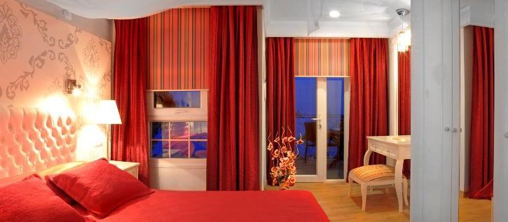
Interior of modern apartment can be viewed not only as an attempt to create warmth and comfort, but also as an attempt to reflect the character and personality of its owners. Styles, shapes, materials - all components that can arise in one harmonious picture only when perfectly matched the color palette for all elements. The power of color - a great power. Everyone has their own unique sense of color: someone like shades of pastel palette, someone dreams of a black and white living room, but for someone the perfect color for kitchen furniture is bright yellow. Here the choice will always be yours, but there are some basic rules that will help you identify and make the right choices about colors for your home. Firstly, we must remember that even your passion for a specific color may simply not withstand the test of time.This is especially true of bright and intense colors, so choosing the red wallpaper for the living room, remember that the color is very bright, saturated and heavy eye. Catchy and aggressive tones, wallpaper, upholstery and major elements of the interior will irritate the eyes, chaining themselves to excessive attention, and eventually cause rejection. Therefore, all the bright colors is better to replace the less aggressive tones, and such bold colors are best left to the rooms and spaces where you are the minimum amount of time: dressing room, hallways, entrance or balcony. Secondly, preferring polar colors (eg, black and white), do not forget that correctly pick shades of accessories and other items much more difficult than it seems at first glance. It is highly probable that the items will either get lost in the background contrast of the base portion, or distracting from the overall color of the ensemble that will immediately catch the eye.The emphasis in this monochromatic scheme - it is not easy, of course, in addition to the well-known combination of black, white and red, all other experiments with a palette should be balanced and cautious. Only in this way you will be able to achieve harmony. Third, pay attention on the semantics of each color. Shades of meaning have their constituents, and knowledge of the intricacies will help you achieve not only the visual and aesthetic harmony, and balance the atmosphere of any living space. Fourth, if you choose a certain style for your apartment, it is important to comply with the rules of color, due to this style. For example, an apartment in an elegant French style wise to give preference to pastel tones for the Scandinavian style does not skimp on the shades of white and blue, for the avant-garde style, choose saturated colors, but it is not necessary to give preference to too bright, vulgar tones.The brightness is more suitable for small items of decoration. After enduring all the elements of the ensemble in the appropriate colors, you will add interior finish and harmony. Finally, never forget that each room has its own function in the home. That is why all the colors you have chosen to be functionally and logically combined with these facilities. In other words, you should not choose dark colors for the nursery and toxic saturated colors for bedrooms. Let every coloristic experiment will be elegant and thinned, and the main thing is justified. The desire to make your apartment a unique should not be a reason for yet another repair, because the chosen color turned her into a room in the abstract modern art gallery instead of a cozy family nest. Author: June Turner
Поделиться:.jpg)

.jpg)
.jpg)